
UX PROJECT SHOWCASE
UX PROJECT SHOWCASE
Designing Authority:
Redesigning a Premium Business Consultant's Personal Brand Website
Designing Authority:
Redesigning a Premium Business Consultant's Personal Brand Website
View Viola Mind Website
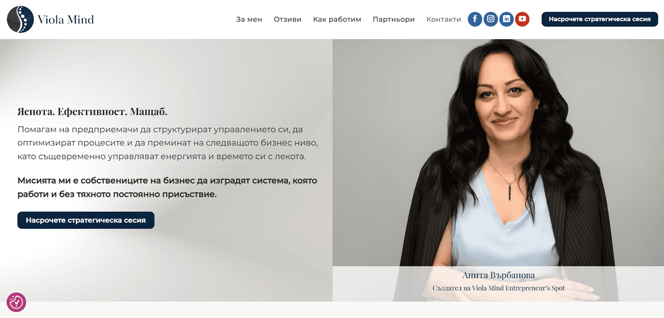
Before After


Project Overview
Project Overview
About
Viola Mind is the personal brand of Anita Varbanova —
a fractional management consultant who helps business owners restructure their operations, exit day-to-day management, and scale their companies. The existing website no longer reflected Anita's independent positioning and the premium direction she was taking her brand.
Viola Mind is the personal brand of Anita Varbanova — a fractional management consultant who helps business owners restructure their operations, exit day-to-day management, and scale their companies. The existing website no longer reflected Anita's independent positioning and the premium direction she was taking her brand.
The redesign needed to position Anita as a premium,
high-ticket consultant in the Bulgarian market — targeting business owners with teams of 15+ people who value their time and demand the best.
The redesign needed to position Anita as a premium, high-ticket consultant in the Bulgarian market — targeting business owners with teams of 15+ people who value their time and demand the best.
Before

After

Business Impact:
The website is one of Anita's main client acquisition channel. Every design decision was made to build enough trust and authority that a busy entrepreneur — reading on their phone, in between meetings — would stop scrolling and book a free strategy session.
The website is one of Anita's main client acquisition channel. Every design decision was made to build enough trust and authority that a busy entrepreneur — reading on their phone, in between meetings — would stop scrolling and book a free strategy session.
The site doesn't sell the service. It sells the meeting. Anita closes the rest.
The site doesn't sell the service. It sells the meeting. Anita closes the rest.
Team
UX Designer
UX Designer
Developer
Developer
Stakeholder
Stakeholder
Industry
Business Consulting / Personal Brand / Executive Advisory
Business Consulting / Personal Brand /
Executive Advisory
My Role
I led the complete visual redesign and brand identity refresh of Viola Mind. Working directly with the stakeholder, I translated her positioning and brief into a conversion-focused, premium one-page website designed for high-intent entrepreneurs.
Design Activities
Brand Identity & Visual Direction: Analyzed the existing brand and moodboard provided by the stakeholder. Built a complete color system from scratch — designed to communicate luxury, trust, and authority. Redesigned the existing logo to align with the new color palette and premium direction. Created social media cover banners for Facebook, LinkedIn and YouTube as part of the rebrand launch.
Typography & Design System: Selected and paired Playfair Display for headings and Montserrat for body text — a combination that communicates luxury while remaining highly legible in both Bulgarian and English. Built a complete Figma style guide including color tokens, text styles, button components, and design rules for developer handoff.
Information Architecture & UXWriting: Structured the one-page layout to guide the user through a deliberate emotional journey — from authority and credibility to personal connection and finally to action. Every section has a single purpose in that journey. Worked carefully on the presentation of Anita's two service formats to make them scannable, clearly differentiated, and conversion-focused.
UI Design: Designed the full desktop mockup in Figma across 12 sections — Hero, Social Proof, Manifesto, Benefits, AI Block, Process, Service Formats, Confidentiality, About, Contact, Partners, and Footer. Focused on white space, visual rhythm, and a storytelling scroll concept — "One Day in the Life of a Strategic Advisor."
Developer Handoff: Prepared a structured Figma file with named color styles, text styles, components, prototype and detailed animation notes for the WordPress developer — ensuring clean implementation without ambiguity.
Project Outcomes
Premium Brand Identity
Delivered a complete visual rebrand — color system, logo refresh, typography, and social media visuals — that positioned Viola Mind as a high-ticket consultancy and established Anita as an independent premium brand in the Bulgarian market.
Conversion-Focused One-Pager
Designed a single-page experience where every section serves one goal: earning enough trust for the visitor to book a meeting. Multiple strategically placed CTAs all lead to one action — Calendly booking.
Live Results
The redesigned website launched in July 2026. In the first two days combined, the site recorded 80 unique new visitors — entirely through organic traffic. Calendly booking rates and full conversion data will be published here within the next 4–6 weeks as results accumulate.
What I learned
AI as a Productivity Partner
I integrated Claude AI as a PM and strategic thinking partner throughout the entire workflow. I used it to analyze the client brief, define the information architecture, pressure-test design decisions and structure the developer handoff. This significantly accelerated the project timeline and improved the quality of my decisions. AI didn't replace my design judgment — it sharpened it.
Conversion UX
Conversion-focused design has been central to my approach across projects. With Viola Mind, the stakes were particularly clear — the single success metric was Calendly bookings from high-ticket entrepreneurs. Every design decision was pressure-tested against one question: does this make a busy business owner more likely to book a meeting? This sharpened my discipline around CTA placement, white space, UX writing, and the emotional journey of the user — reinforcing that great design is not about aesthetics alone, but about outcomes.
Credibility Through Restraint
Premium personal brand design is about what you leave out, not what you add. No stock icons, no aggressive pop-ups, no cluttered layouts. Trust is built through white space, strong typography, real testimonials, and a confident visual system.
Stakeholder Collaboration at Its Best
The collaboration between myself, the developer, and Anita was exceptionally smooth. Clear brief, fast feedback cycles, and mutual respect for each other's expertise. This is what productive three-way collaboration looks like in practice.
Service Clarity Drives Conversion
Anita offers two distinct service formats at a premium price point. Presenting them clearly — differentiated visually and structurally — required careful UX thinking. The goal was not to explain everything, but to communicate enough that the right person clicks the CTA.
1
Brief Analysis & Discovery
Received and deeply analyzed the client brief. Defined the target audience, emotional goals, content hierarchy, and conversion objective. Identified that the single success metric for this project is Calendly bookings from qualified entrepreneurs.
2
Brand Direction & Color
System
Studied the stakeholder's moodboard and existing brand assets. Built a premium palette — designed to communicate luxury, authority, and trust. Redesigned the existing logo to align with the new color direction while preserving its recognizability and brand equity.
4
Information Architecture
Mapped the full one-page structure across 12 sections. Defined the emotional journey of the user from first impression to CTA. Structured the two service formats for maximum scannability and conversion.
6
Developer Handoff
Delivered a structured Figma file with named styles, component specifications, and a dedicated animation notes frame for the WordPress developer. Communicated fade-in scroll animations, counter animations, and smooth scrolling behavior as written specs.
5
UI Design
Designed the complete desktop mockup in Figma. Applied the storytelling scroll concept throughout — each section representing a moment in the consultant's day. Focused on generous white space, visual contrast between sections, and consistent CTA placement.
3
Typography & Style Guide
Selected Playfair Display and Montserrat. Built a complete Figma style guide — color tokens, text styles, button specs, and spacing system — before writing a single line of design.

© 2026 Georgi Ivanov. All Rights Reserved.
Want to collaborate?
Contact Me
E-mail: georgeivanovmtg@gmail.com
Design Process
7
UX Measurements
Key metrics being tracked post-launch: Calendly booking rate, monthly unique visitors and mobile vs. desktop engagement. Results will be published here within 4–6 weeks of launch.
© 2026 Georgi Ivanov. All Rights Reserved.
Want to collaborate?
Contact Me
E-mail: georgeivanovmtg@gmail.com
© 2026 Georgi Ivanov. All Rights Reserved.
Want to collaborate?
Contact Me
E-mail: georgeivanovmtg@gmail.com
Design Activities
Brand Identity & Visual Direction: Analyzed the existing brand and moodboard provided by the stakeholder. Built a complete color system from scratch — designed to communicate luxury, trust, and authority. Redesigned the existing logo to align with the new color palette and premium direction. Created social media cover banners for Facebook, LinkedIn and YouTube as part of the rebrand launch.
Typography & Design System: Selected and paired Playfair Display for headings and Montserrat for body text — a combination that communicates luxury while remaining highly legible in both Bulgarian and English. Built a complete Figma style guide including color tokens, text styles, button components, and design rules for developer handoff.
Information Architecture & UX Writing: Structured the one-page layout to guide the user through a deliberate emotional journey — from authority and credibility to personal connection and finally to action. Every section has a single purpose in that journey. Worked carefully on the presentation of Anita's two service formats to make them scannable, clearly differentiated, and conversion-focused.
UI Design: Designed the full desktop mockup in Figma across 12 sections — Hero, Social Proof, Manifesto, Benefits, AI Block, Process, Service Formats, Confidentiality, About, Contact, Partners, and Footer. Focused on white space, visual rhythm, and a storytelling scroll concept — "One Day in the Life of a Strategic Advisor."
Developer Handoff: Prepared a structured Figma file with named color styles, text styles, components, prototype and detailed animation notes for the WordPress developer — ensuring clean implementation without ambiguity.
Project Outcomes
Live Results
The redesigned website launched in July 2026. In the first two days combined, the site recorded 80 unique new visitors — entirely through organic traffic. Calendly booking rates and full conversion data will be published here within the next 4–6 weeks as results accumulate.
Premium Brand Identity
Delivered a complete visual rebrand — color system, logo refresh, typography, and social media visuals — that positioned Viola Mind as a high-ticket consultancy and established Anita as an independent premium brand in the Bulgarian market.
Conversion-Focused One-Pager
Designed a single-page experience where every section serves one goal: earning enough trust for the visitor to book a meeting. Multiple strategically placed CTAs all lead to one action — Calendly booking.
What
I learned
AI as a Productivity Partner
I integrated Claude AI as a PM and strategic thinking partner throughout the entire workflow. I used it to analyze the client brief, define the information architecture, pressure-test design decisions and structure the developer handoff. This significantly accelerated the project timeline and improved the quality of my decisions. AI didn't replace my design judgment — it sharpened it.
Conversion UX
Conversion-focused design has been central to my approach across projects. With Viola Mind, the stakes were particularly clear — the single success metric was Calendly bookings from high-ticket entrepreneurs. Every design decision was pressure-tested against one question: does this make a busy business owner more likely to book a meeting? This sharpened my discipline around CTA placement, white space, UX writing, and the emotional journey of the user — reinforcing that great design is not about aesthetics alone, but about outcomes.
Credibility Through Restraint
Premium personal brand design is about what you leave out, not what you add. No stock icons, no aggressive pop-ups, no cluttered layouts. Trust is built through white space, strong typography, real testimonials, and a confident visual system.
Stakeholder Collaboration at Its Best
The collaboration between myself, the developer, and Anita was exceptionally smooth. Clear brief, fast feedback cycles, and mutual respect for each other's expertise. This is what productive three-way collaboration looks like in practice.
Service Clarity Drives Conversion
Anita offers two distinct service formats at a premium price point. Presenting them clearly — differentiated visually and structurally — required careful UX thinking. The goal was not to explain everything, but to communicate enough that the right person clicks the CTA.
1
Brief Analysis & Discovery
Received and deeply analyzed the client brief. Defined the target audience, emotional goals, content hierarchy, and conversion objective. Identified that the single success metric for this project is Calendly bookings from qualified entrepreneurs.
2
Brand Direction & Color
System
Studied the stakeholder's moodboard and existing brand assets. Built a premium palette — designed to communicate luxury, authority, and trust. Redesigned the existing logo to align with the new color direction while preserving its recognizability and brand equity.
4
Information Architecture
Mapped the full one-page structure across 12 sections. Defined the emotional journey of the user from first impression to CTA. Structured the two service formats for maximum scannability and conversion.
6
Developer Handoff
Delivered a structured Figma file with named styles, component specifications, and a dedicated animation notes frame for the WordPress developer. Communicated fade-in scroll animations, counter animations, and smooth scrolling behavior as written specs.
5
UI Design
Designed the complete desktop mockup in Figma. Applied the storytelling scroll concept throughout — each section representing a moment in the consultant's day. Focused on generous white space, visual contrast between sections, and consistent CTA placement.
3
Typography & Style
Guide
Selected Playfair Display and Montserrat. Built a complete Figma style guide — color tokens, text styles, button specs, and spacing system — before writing a single line of design.
Design Process
7
UX Measurements
Key metrics being tracked post-launch: Calendly booking rate, monthly unique visitors and mobile vs. desktop engagement. Results will be published here within 4–6 weeks of launch.
© 2026 Georgi Ivanov. All Rights Reserved.
Want to collaborate?
Contact Me
E-mail: georgeivanovmtg@gmail.com